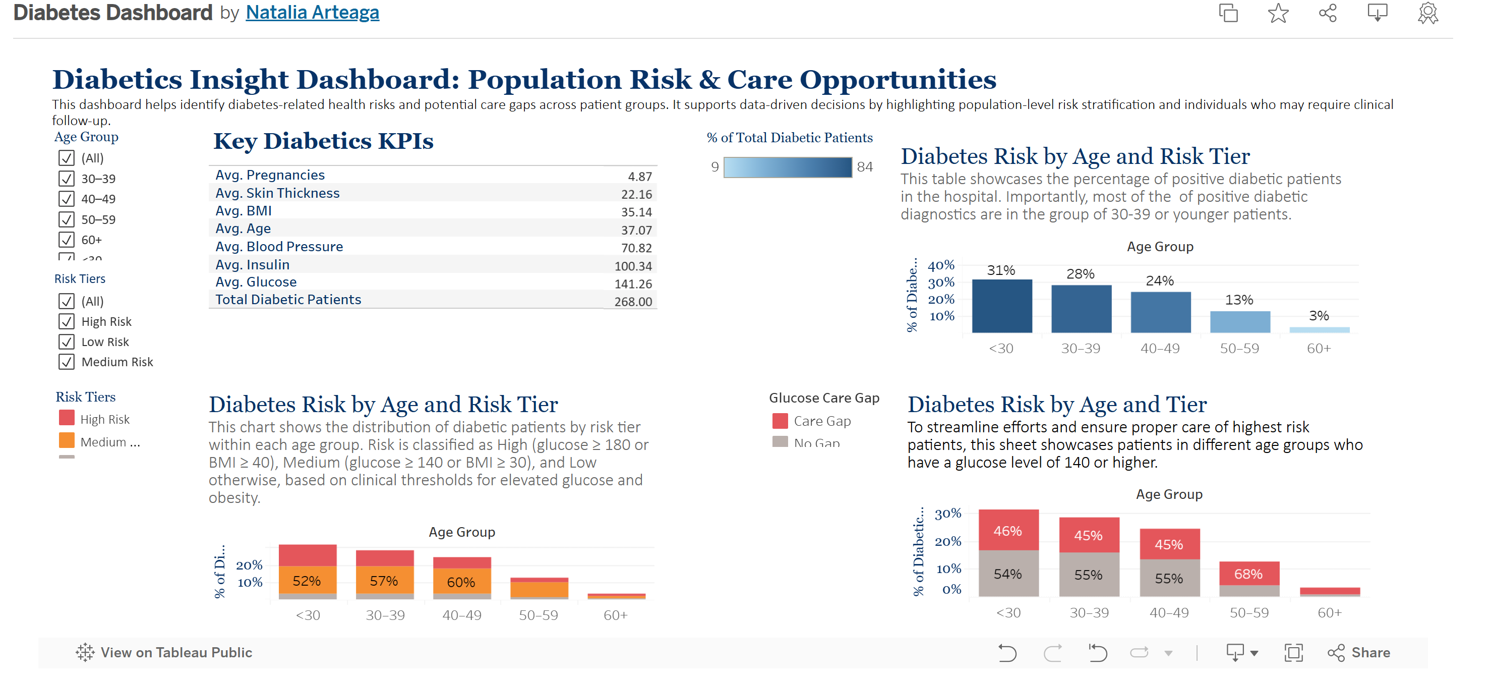
Diabetics Insight Dashboard: Population Risk & Care Opportunities
Inspired by my father’s Type 1 diabetes diagnosis, I harnessed real-world clinical data to build an interactive Tableau dashboard that maps key health indicators—glucose levels, BMI, and demographic factors—into clear risk tiers. The dashboard highlights trends and care gaps, delivering actionable insights for earlier detection, targeted outreach, and better patient management. Lastly, I created a machine learning model to predict future diabetes incidences. Ultimately, this project aims to demonstrate how data science can translate complex clinical signals into practical tools that change lives.
Tableau Dashboard
1. Key Diabetics KPIs
Purpose:
Summarizes average clinical metrics across the diabetic population in the dataset, including age, BMI, glucose, blood pressure, insulin, and more.
Use:
This sheet provides a high-level view of the population’s health indicators and helps users quickly assess areas of concern (e.g., elevated average glucose or BMI).
2. Positive Diabetic Diagnostic by Age Group
Purpose:
Shows the distribution of patients who received a positive diabetes diagnosis (Outcome = 1) across different age groups.
Use:
This helps identify which age groups are more affected. For example, if the majority of positive outcomes fall in the <30 or 30–39 group, it may signal early-onset trends worth investigating.
3. Diabetes Risk by Tier
Purpose:
Classifies patients into High, Medium, or Low Risk based on clinical thresholds:
- High Risk: Glucose ≥ 180 or BMI ≥ 40
- Medium Risk: Glucose ≥ 140 or BMI ≥ 30
- Low Risk: Below both thresholds
Use:
This view enables stakeholders to prioritize care management and preventive strategies by understanding the overall risk makeup of the population.
4. Diabetes Risk by Age and Tier
Purpose:
Displays the breakdown of risk tiers within each age group.
Use:
This cross-segmented view answers questions like, “Which age groups are most likely to be at high risk?” and “Are younger populations showing risk indicators?” It also supports targeted intervention efforts by demographic.
5. Care Gap Flag
Purpose:
Highlights patients with glucose levels ≥ 140 who are not yet diagnosed as diabetic. These patients represent a care gap – individuals who may need monitoring or intervention.
Use:
Clinicians and care managers can use this to identify and prioritize outreach to at-risk individuals who may not yet be receiving diabetic care.
6. Diabetes Risk by Age and Tier (100% Stacked View)
Purpose:
Normalizes the distribution of risk tiers as a percentage within each age group.
Use:
This format makes it easier to compare relative risk distribution across age groups (e.g., what % of patients in each group are high risk). It eliminates the influence of total patient count and focuses on proportional risk.
Click here to view the live dashboard
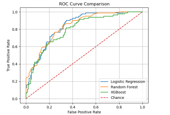
Machine Learning Model: Diabetes Risk Prediction
To support early detection of diabetes, I developed a machine learning model using linear regression and real-world patient data. The model analyzes key factors—including glucose levels and BMI—to predict the likelihood of diabetes with 80% accuracy. This tool demonstrates the potential of data science to identify high-risk patients and enable more proactive, personalized care in healthcare settings.
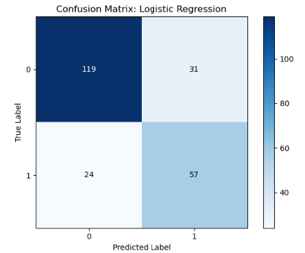
Logistic Regression is the best of the three, because:
- Highest ROC AUC (0.8365)
Indicates it has the strongest overall discrimination between diabetics and non-diabetics. - Best positive‐class F1 (0.6746)
Balances precision (0.6477) and recall (0.7037) on the diabetic class more effectively than RF (0.6014) or XGB (0.6375). - Highest weighted F1 (0.7640) and accuracy (0.7619)
Shows it delivers the strongest overall predictive performance on the test set.
| Model | Accuracy | ROC AUC | Precision (1) | Recall (1) | F1-score (1) | Weighted F1 |
|---|---|---|---|---|---|---|
| Logistic Regression | 0.7619 | 0.8365 | 0.6477 | 0.7037 | 0.6746 | 0.7640 |
| Random Forest | 0.7532 | 0.8344 | 0.6935 | 0.5309 | 0.6014 | 0.7442 |
| XGBoost | 0.7489 | 0.7970 | 0.6456 | 0.6296 | 0.6375 | 0.7482 |
In short, despite its simplicity, logistic regression gives the best trade-off between sensitivity and specificity here. The more complex models may need further hyperparameter tuning or engineered features to outperform this baseline.
Here is the ROC Curve
Here is the Confusion Matrix


Thank you for exploring this dataset with me!
